You never get a second chance to make a great first impression. This is why your welcome email series is so important.
After reviewing Iterable’s Expedia vs. Priceline teardown, I was shocked to see that neither brand sent a coordinated welcome series. This struck me as a major missed opportunity to make new users feel welcomed and confident about their ability to get the best deals.
My name is Carl, and I am the Director of Marketing at MailCharts — the tool e-commerce marketers use to plan their email campaigns and track their competitors. As a daily MailCharts user, I see tons of great (and not so great) welcome series. Today I’ll be sharing some tips and examples to help you build and optimize your own welcome series.
Why a welcome series?
Marketers are catching on to the concept of the one-time welcome email as an engagement booster and competitive advantage, but the percentage of marketers at leading retailers who send a multi-touch welcome series is about 49%, according to Iterable’s User Engagement Top 100 Report: Email Marketing in E-Commerce.
Based on the customer-journey reports we run on brands here at MailCharts, I expect the percentage to be much lower. This means that a welcome series can give you a competitive edge, not just over competing brands but against all the other emails clamoring for your recipient’s attention in the inbox.
7 tips to tune up your welcome emails
If you send a single welcome message, think about whether a second message could add value to your email program. One of the champions of the welcome email series is retailer Tory Burch, which sends five unique, objective-driven emails in its welcome series. (We dive into the Tory Burch welcome series below.)
But don’t try to go from one to five emails all at once. Add one email at a time to see if each new email moves the needle for you.
Before exploring Tory Burch’s email program, let’s go over seven tips you can use to send more effective welcome emails — whether you stick to a one-time message or level your way up to an automated series.
1. Personalization goes a long way
Personalized emails help you increase open rates, click rates, and (as a byproduct) deliverability. If you have the data available — either from when subscriber opted-in or from on-site activity — personalize your emails so they feel as behavior-based as possible.
2. Assign an objective to each message
This will help you evaluate your email’s effectiveness and guide the email content and imagery.
Here’s an example for a three-email series, from eConsultancy:
Email 1:
- Objective: Welcome & set expectations
- KPI: Website visits
Email 2:
- Objective: Information about loyalty program
- KPI: Loyalty sign-ups
Email 3:
- Objective: Offer incentive to shop
- KPI: Purchases
3. Invite subscribers to take action
Ask subscribers to invest a little time on a low-hurdle CTA. This could be viewing your most popular products, completing their profile, or answering a one-or-two-question survey (which will help you with your segmentation efforts).
Be sure to collect behavioral data based on the links they click in the welcome email and where they go on your site. This data will be very valuable as you increase personalization throughout the growing relationship.
4. Make it mobile
Some of the welcome emails in Iterable’s teardowns made me wonder whether their designers realize that more than 50% of emails are opened on mobile these days.
This is not uncommon by the way: MailCharts data shows that only 48% of e-commerce emails are mobile-optimized.
Optimize your welcome emails for mobile — the same way you do with your website and landing pages.
5. Beware overlapping email sequences
It’s not uncommon to see overlapping triggered campaigns. This can happen if, say, I create an account and then abandon my shopping cart. You need to make sure both the welcome series and the cart abandonment series are not emailing me at the same time (if I’m in one, exclude me from the other).
It’s a good idea to check up on your automation flows and audit your own email program every quarter — better be safe and make sure your campaigns are working the way you intended. You can’t control what your customers do on your site, but you can try to anticipate these kinds of situations.
6. Create a strong inbox presence
Your from-name, subject line, and preheader all work together to build trust and prompt recipients to open your emails.
- Include your brand in your “from name” for fast recognition (e.g., “Tory Burch,” “Iterable,” “Carl from MailCharts,” etc).
- Front-load your subject line in case email clients truncate it (especially on mobile, where your subject line is often cut at 40 characters).
- Use the preheader — the first line of copy in your email message — to either supplement the subject line or mention a secondary offer.
7. Manageable bites is the way to go
You don’t have to cram everything that new subscribers should know about your brand into a single message. By sending a few emails as part of your welcome series you can educate, inspire and incentivize without overwhelming your customers.
Analyzing Tory Burch’s Welcome Series
Earlier in the post, we mentioned that Tory Burch sends five unique, objective-driven emails as part of their welcome series.
Here’s a quick overview of their welcome series:


As it turns out, Tory Burch was also the welcome-email champion in Iterable’s User Engagement Report.
Let’s dive into each individual email.
Email 1
- Objective: Establish credibility & drive first purchase
- Subject line: Welcome to Tory Burch, <name>
- Preheader: Limited Time Free Shipping & Free Returns on All Orders
- URL: https://www.mailcharts.com/emails/f7b248cf-cef9-f985-23d2-f8a0ccc51e5d
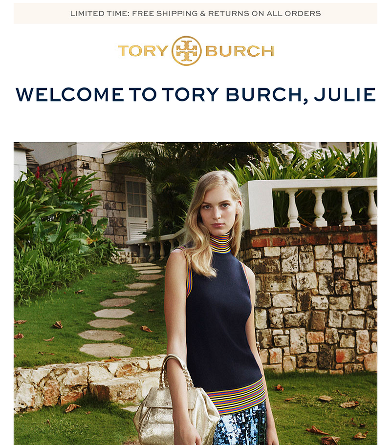
This email is chic, friendly and helpful. It links to different product categories, establishes glamour with the “as seen in New York Fashion Week” section, and incentivizes you to complete your first purchase with a noticeable but not all-in-your-face 10% off discount (which is offered at email-capture time).
Email 2
- Objective: Educate you on ways to shop
- Subject line: <name>, meet Tory
- Preheader: Limited Time Free Shipping & Free Returns on All Orders
- URL: https://www.mailcharts.com/emails/aacbbd68-04a8-96a6-1171-8e13a53cc3a9
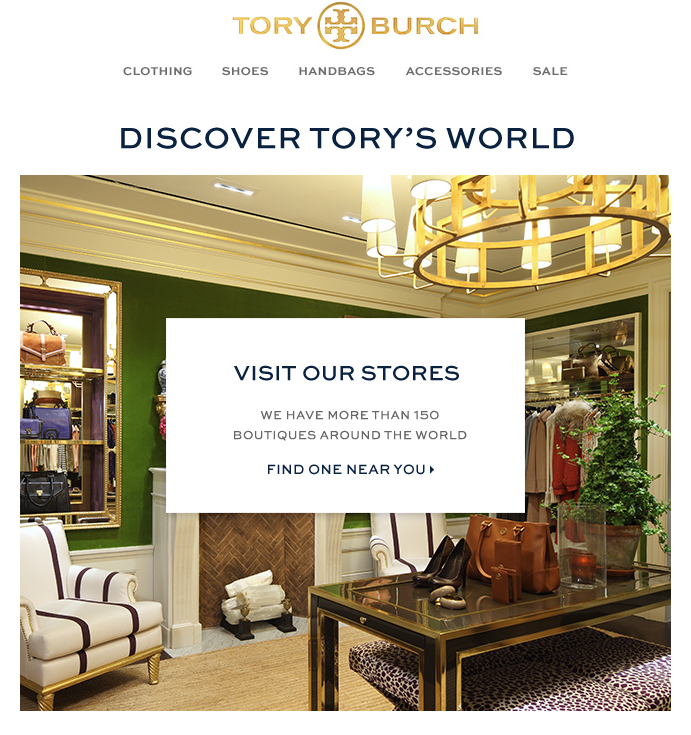
Tory Burch understands that shopping is all about the experience. This is why they invite you to visit a nearby boutique, highlight their complimentary gift packaging services and do away with shopper anxiety by mentioning free returns and exchanges.
Email 3
- Objective: Promote social media connections and mobile app
- Subject line: @toryburch
- Preheader: Limited Time Free Shipping & Free Returns on All Orders
- URL: https://www.mailcharts.com/emails/2746f92e-1e2a-716b-bc82-afd2a9251ce5

This email invites the subscriber to connect with Tory Burch’s social channel and download the app. But instead of just loading a bunch of icons into the email, the message explains why customers should connect. Notice how each social channel has a clear angle.
Email 4
Objective: Promote brand-differentiating customer services
Subject line: How can we help you, <name>?
Preheader: Limited Time Free Shipping & Free Returns on All Orders
URL: https://www.mailcharts.com/emails/96659e00-7616-8edc-6d10-63850bbca025

This email builds on parts of email 3, sharing further details about their global shipping, complimentary gift wrapping, free and easy returns, and much more. Talk about setting yourself apart!
Email 5
- Objective: Promote store visit and services
- Subject line: A tour of our boutiques
- Preheader: Limited Time Free Shipping & Free Returns on All Orders
- URL: https://www.mailcharts.com/emails/871bc2a8-426c-2d3a-51ac-199115be1ffd

This email is great as it promotes Tory Burch boutiques around the world and includes geolocation with a map showing the closest store. Notice how the email goes into details describing what their boutique experience is like.
As you can see from these Tory Burch emails, their welcome journey feels personal, each email has a clear objective encouraging readers to take action, and they all have a strong inbox presence.
If you’d like to learn more about MailCharts — and how we take the hassle out of email marketing planning and research — visit our website or drop us a note. We’ll be happy to answer your questions or walk you through a demo of our app.

