In June, Apple rocked the marketing world with their announcement of Mail Privacy Protection and a slew of other iOS 15 features that promised to shake things up for many marketers. Now, with WWDC 21 in the rear view, here we are!
We’ve shared our initial thoughts on the subject previously, and when the iOS 15 beta was released, we were eager to get our hands on it and see what’s ahead of this week’s go-live date. And now that we’ve had the chance to dig in, we’ve found our POV remains the same: these changes are fantastic for consumers and we love seeing major companies like Apple take a privacy-first stance—especially on the mobile front.
iOS 15 at Iterable
Now, as the mobile Product Lead here at Iterable, this blog is going to focus on our mobile response. As a quick refresher, iOS 15 introduced two new features, Focus mode and notifications summary, that help consumers maintain balance in a world where push notifications are constantly vying for your attention.
Focus mode enables you to schedule times of day or even locations where you don’t want to be pinged by notifications, other than those from specific apps or contacts (think Slack or messages from family). Anything else is going to be shown to you after Focus mode is turned off.
Notification summary, on the other hand, lets you replace the ad-hoc drips of incoming push notifications from your chosen apps with a summarized digest of received messages throughout the day. In this case, Apple uses machine learning to comb through user engagement and other data to determine which apps get marquee placement in the summary, while the rest are seen only after tapping into the summary.
Personally, we’re big fans of both—especially Focus mode during work hours. It’s been awesome. That said, I’d imagine adoption will be substantial, raising a couple of key deliverability questions for marketers:
- If a user is in Focus mode, how can I reach them with time sensitive information like delivery notices or critical updates?
- If my app is featured in the notification summary, but my user has multiple queued messages, how do I know which one bubbles to the top?
Push Notification Interruption Levels
Great questions! Staying top of mind is critical which is why we’re introducing two new push notification settings into our push offering this quarter. The first, aptly named interruption levels, lets marketers choose the right level of urgency for their push messages:
- Passive: less obtrusive, won’t wake or vibrate your phone—they go straight to the notification center and and are listed on notification summaries
- Active: your typical iOS push. They wake the screen, make a sound or vibrate once received—BUT they won’t break through Focus mode.
- Time-Sensitive: similar to Active, but WILL break through Focus mode even if they aren’t from an “approved” app.
- Critical: as the name entails, this level alert will come through unimpeded. (This alert level requires special approval from Apple and is typically reserved for governmental, public agency or healthcare app use cases.)
| Interruption level | Overrides scheduled delivery | Breaks through Focus Mode | Overrides ring/silent switch |
| Passive | ❌ | ❌ | ❌ |
| Active | ❌ | ❌ | ❌ |
| Time Sensitive | ✅ | ✅ | ❌ |
| Critical | ✅ | ✅ | ✅ |
Important aside: We applaud Apple for enabling developers and marketers to prioritize their messages’ importance. However, it’s extremely important that marketers ensure their content warrants the given interruption levels. Don’t take advantage of this power.
The first time a user receives a time sensitive notification, they’ll be asked if they would like to continue receiving such messages. Be warned! Apple makes it easy for users to opt-out from further time sensitive messages should they feel your message wasn’t actually time sensitive in the first place.
It’s probably not worth severing your connection over a promo push. Use your best judgment here. If you’re interested in reading more, Apple provides some tips in their Human Interface Guidelines on how to create a good messaging experience and provides some specific guidelines for using interruption levels appropriately.
Now, back to Iterable! From your iOS Push Template, you can assign any of these levels to your messages from our new drop down menu. Very simple and straightforward with no major change to your typical workflow.
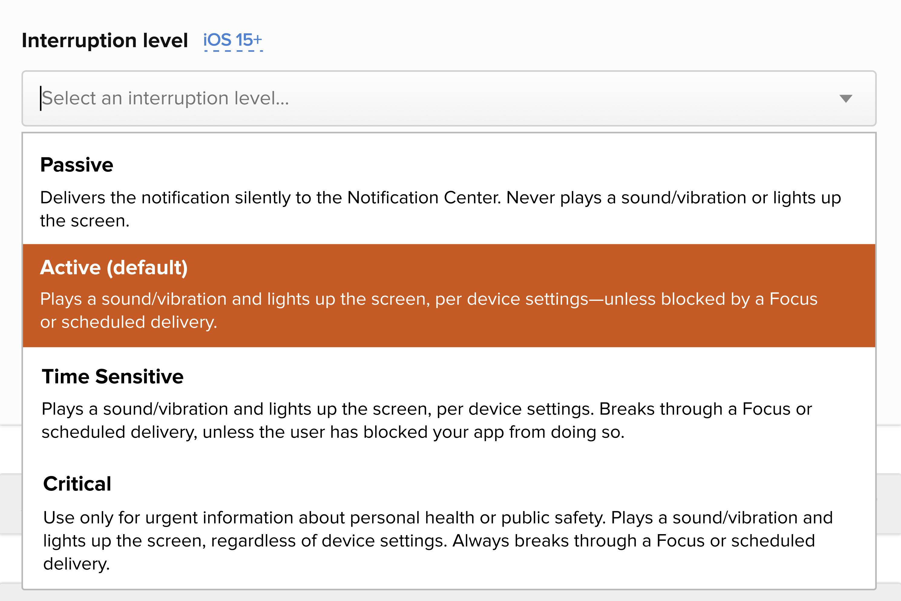

Click, pick, send! Simple as that.
Relevance Score
Next up is Relevance score. As you might’ve guessed, this enables marketers to add an appropriate priority weight to their messages. This weighting controls which notifications will appear at the top of summary (if it’s featured and there are multiple messages from their app).
And much like its close cousin Interruption levels, Relevance score, too, can now be added from the template editor. For simplicity sake, marketers can select their message’s Relevance score from 0.0 to 1.0 from our dropdown to assign the right weighting to their different push messages, or type in an exact desired value.
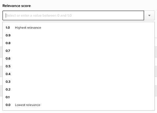

Choose the score that best suits your message.
Push Notification Action Button Icons
And as an added bonus, iOS 15 gives us the ability to add icons to action buttons. You’ve probably seen these action buttons when you sign into an SSO service—that push notification let’s you confirm it’s actually you trying to sign into some account.
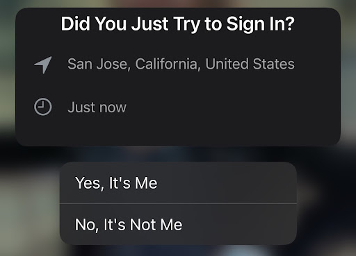

Your typical action button experience
Coming this winter, our push action buttons will support icons to spice up that message! Since experience is the name of today’s game, an added personal touch with the right icon can help make your message more interesting but also give your responses some added visual and intuitive context.


The new action button experience!
Wrapping Up
Like we said, we’re really excited about this consumer-first shift, but we’re even more excited to bring these iOS 15 features to marketers everywhere! We’ve got a full docket of mobile enhancements coming your way this year so make sure to stay tuned!

