Experience is everything these days. It’s rare for a brand to have enough product or service differentiation to stand out and get successfully adopted by customers.
As markets become saturated with more competition, brands must stand out by delivering delightful experiences that engage and retain customers. Successful companies wow their customers with intuitive, valuable experiences in addition to powerful, feature-rich functionality.
Two out of three consumers report they value the experiences from brands over price, pushing focus further on fulfilling their customers’ needs. Customers have come to expect intuitive, delightful design in all user experiences, especially digital ones. Our goal is always to continue to raise the bar.
Look Inward to Grow Outward
We’ve been busily working toward making our platform easier to use throughout our growth as a company. Mary Meeker’s 2018 Internet Trends highlighted that “easy-to-use products [are] becoming pervasive,” validating our pursuit of a more intuitive user experience inside Iterable.
We’ve been leaning into our customers’ own user experiences to prioritize new ways of improving our platform. I’ve personally spent hundreds of hours with our customers at their offices, coffee shops, and virtually on Zoom, watching them use our new product UX and providing real-time feedback about how we can improve it.
From that, we’ve developed some exciting enhancements centered around three key tenets of platform ease: control, clarity, and creation.
1. Control
Having total control over who has access to your Iterable project was a little challenging—we wanted to change that. Account oversight is a necessary part of marketing collaboration, and it should be a simple and intuitive process.
We’ve decreased the time and effort required for admins to manage their colleagues’ access to create better organization and governance at scale for our customers, large and small.
With Organizational Management, we’ve streamlined admins’ user experiences—adding new members to projects, editing roles, and revoking privileges just got easier.
Use Case: Organizational Management
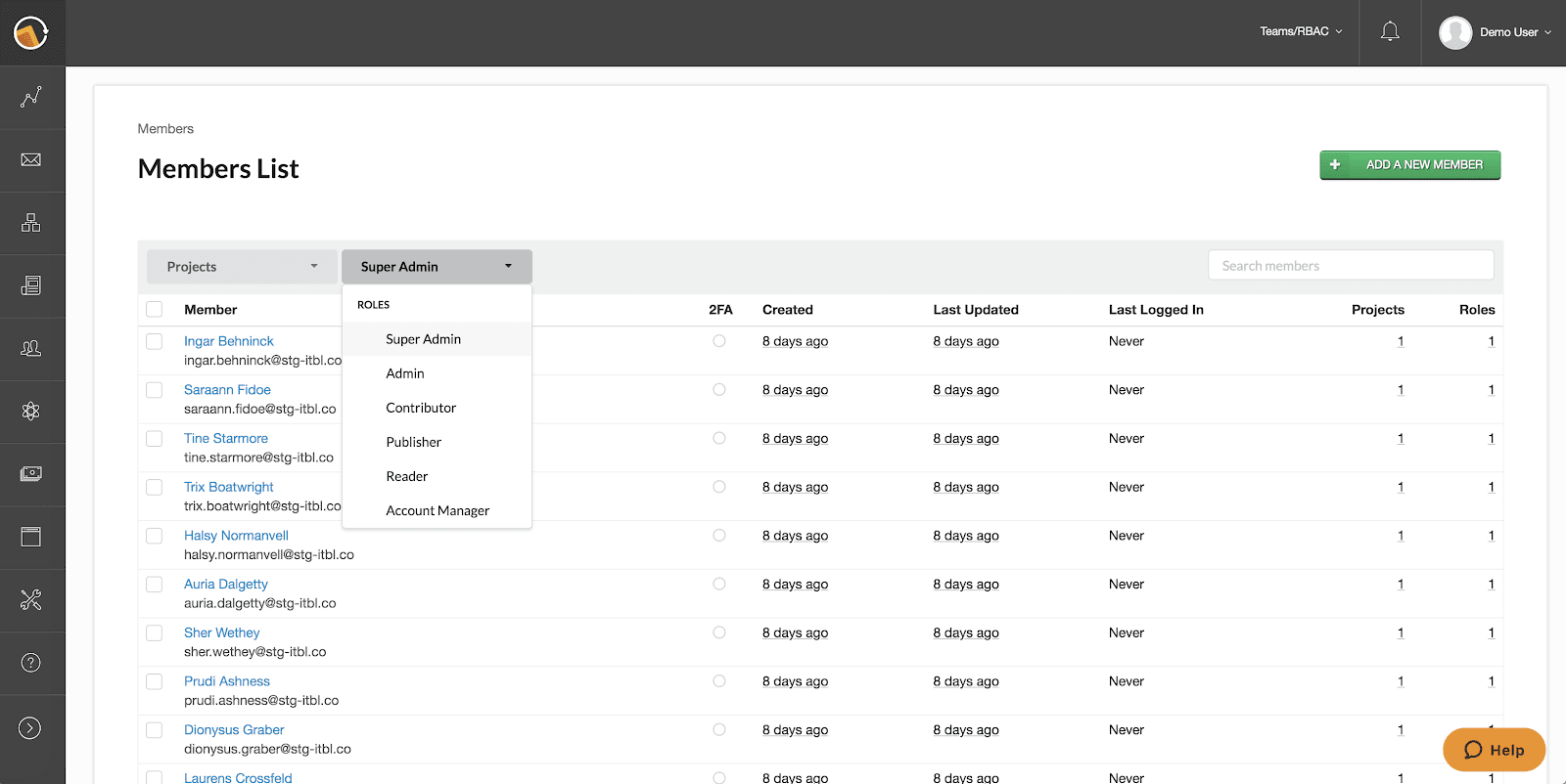

As someone who has managed these types of tools before, I love being able to see a list of everyone who has access to Iterable, filter by the project and role, search for my colleagues, and see when their account was created, last updated, and last logged in.
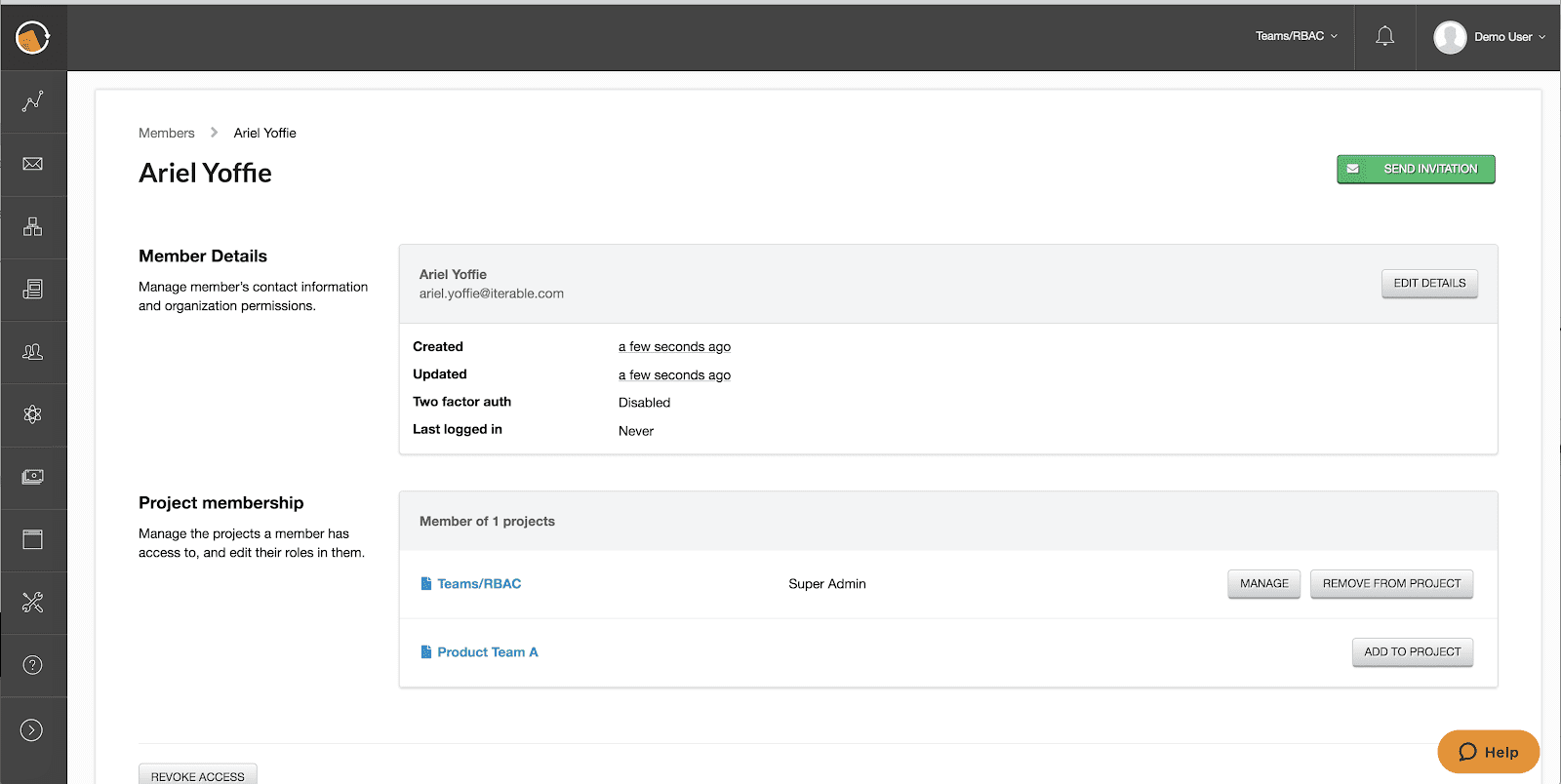

Now, I can add a project and role assignment to any new members of this organization. This is what it looks like when I want to add myself as a new member of Iterable. As an admin, I can send an invitation to create an account on the Iterable platform. If the person I’m inviting forgets to check their email, I can just resend the invite email with a click of the green “Send Invitation” button.
2. Clarity
Simplifying views was an important challenge for us to tackle. Time spent trying to find the workflow or campaign elements you want to refine, is time taken away from the creative process.
We’ve streamlined the workflow management user experience with our Expandable Workflow Campaign View.
Expandable dropdowns appended to the parent workflows now reveal each of that workflow’s associated campaigns. Simply click the caret to jump to any of the listed campaigns and start editing.
Use Case: Expandable Workflow Campaign View
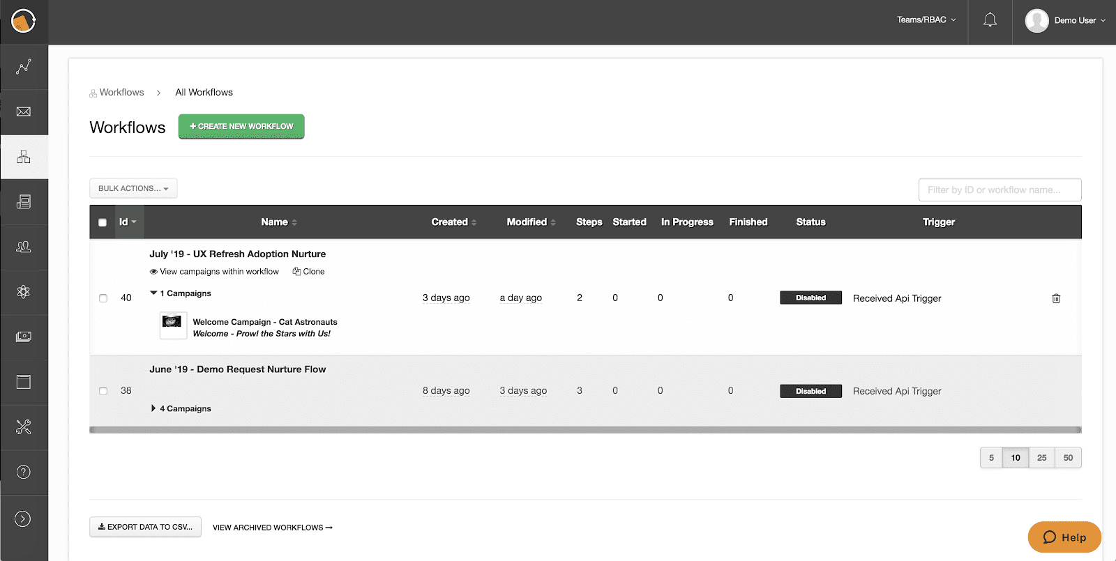

As a former growth marketer, I would’ve loved to able to see my July – UX Refresh Adoption Nurture workflow with the one email to our cat lover customers listed below with a preview of the template, campaign name, and which template I used. I can also see a list of all campaigns in the workflow, including ones I’ve removed from the workflow when I click, “View campaigns within workflow.”
Similarly, finding your marketing-critical templates just got easier!
Simplified Template Management consolidates the template view inside Iterable to create a more concise view of your base templates resulting in simplified navigation and a more intuitive user experience.
A crystal clear view aligned with industry standards means easier template management and a more scalable way for brands to enforce consistent branding standards.
Use Case: Simplified Template Management
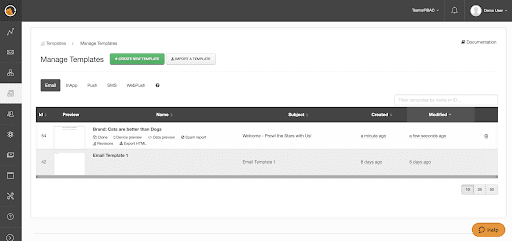

With this simplified approach, I can update my “Brand: Cats are better than Dogs” template (aka, Base Template) so that any campaign manager can just copy from this updated one whenever they create one-off or workflow campaigns. For large and enterprise companies with many brands to manage, this makes it much easier to manage standardized base templates everyone can use in their campaigns.
3. Creation
Agility is a popular buzzword in the marketing community, but it rings true among those focused on growth. We’re always looking for ways for customers to launch campaigns quicker, and we’ve now developed a more efficient way to build and test.
We’ve optimized the way marketers edit the multiple campaign elements that comprise your Workflows.
We’ve introduced Contextual Template Builder & Campaign Analytics and now editing node elements no longer requires toggling between different tabs to adjust elements—now you can click into your different nodes to edit, analyze, or update campaign templates directly inside the Workflow without leaving the page.
Use Case: Contextual Template Builder & Campaign Analytics
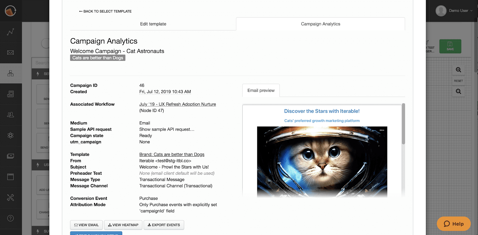

This is a great update because now I can analyze my Welcome Campaign – Cat Astronaut directly in the workflow! I can quickly add the label for the brand “Cats are better than Dogs”, and I can see that I set the campaign conversion event to be a Purchase with direct attribution. I love how easy it is to toggle between analyzing the campaign data, then editing the header font color to make it easier to read and click.
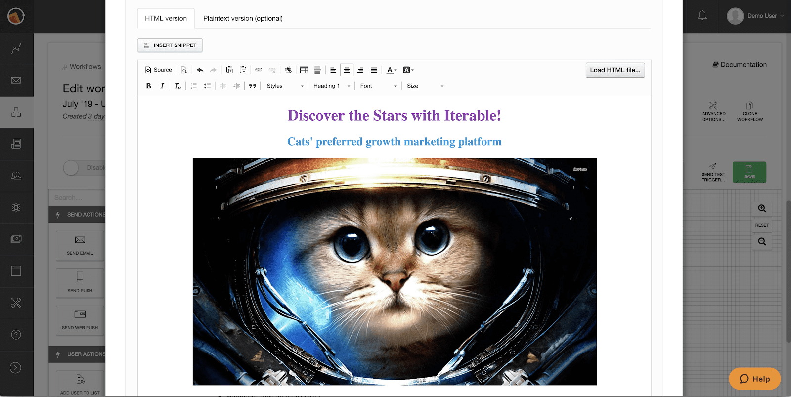

I can also clone the workflow campaign and edit the campaign name, conversion tracking, labels, and template if I want to make it faster than ever to create and test multiple variations of the same welcome campaign!
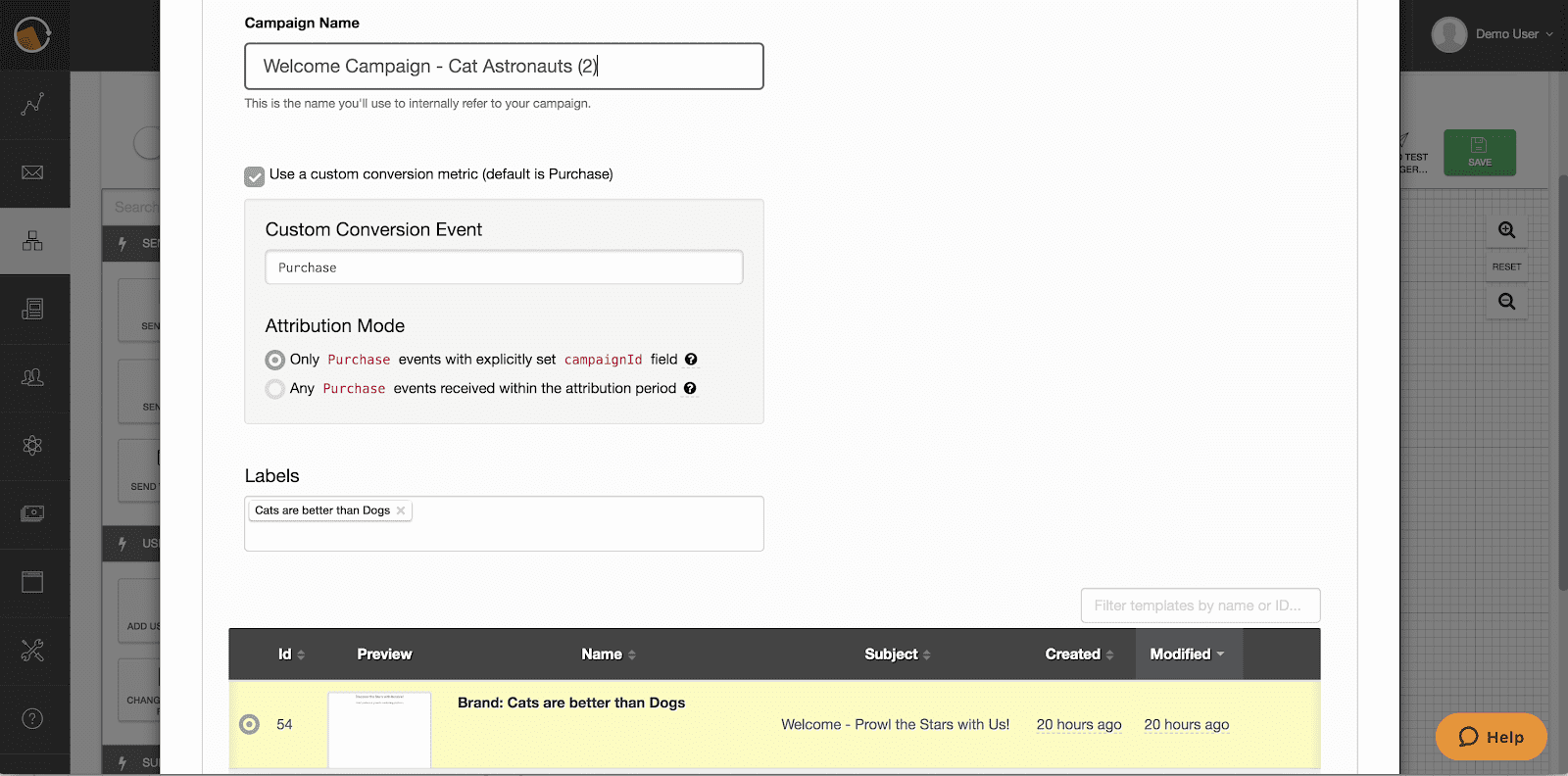

This cat is so cute – I might as well update all future templates to use this new header and cat picture. Now that Iterable has made it easier to find and edit the templates that manage my Brand: Cats are better than Dogs, I can do that even faster than before.
The way users were previously set up to test and preview in-app messages took a few too many steps.
Now with Real-Time In-App Device Previews, you can generate device-specific iOS or Android in-app message previews from your browser.
Marketers can quickly iterate on message design and performance without manually pushing previews to their own phones.
Use Case: Real-Time In-App Device Previews
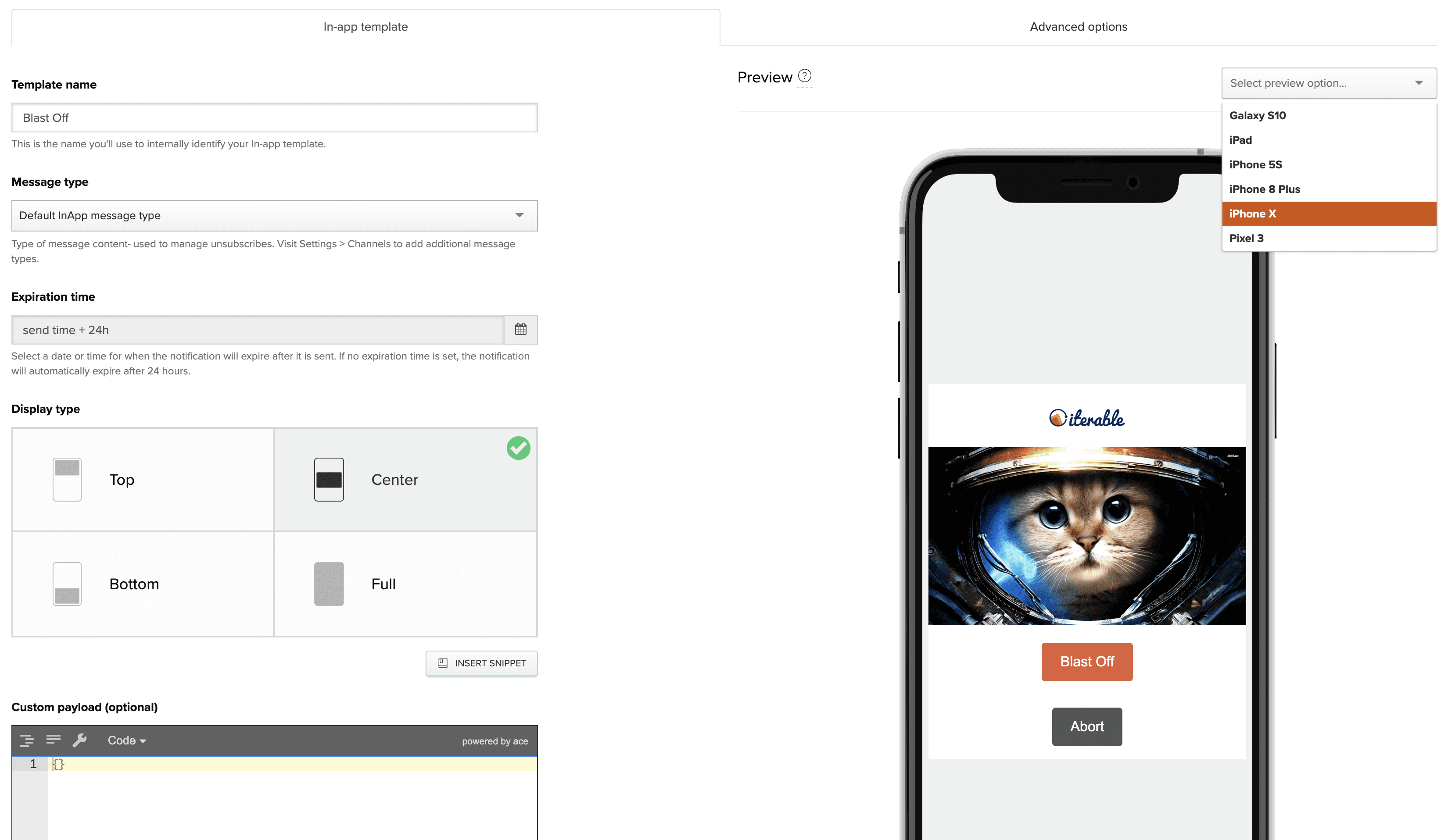

We wanted to speed up in-app and push template creation, offering new functionality in an approachable way to show Iterable has a powerful and flexible yet easy-to-use platform. Not having to preview from my personal device is a great time saver.
What’s Our Next Iteration?
Our customers’ user experiences will always drive the way we develop, iterate, and adapt our platform to exceed their expectations.
We’ll continue to work directly with our customers in our vibrant Iterable Community and iterative user testing of everything from alpha stage prototypes to our production platform.
Balancing Iterable’s growth in tandem with the needs of our expansive customer base will be a challenge, but we know that we’ll succeed as we focus on customer centricity, use design thinking to build empathy, and build products in a data-driven, agile way.
Interested in learning more about all of Iterable’s cool features and functionality? Join us for a demo today!


