A new year is a fresh start. With this fresh start we expect some new trends to emerge in the world of graphic design—particularly in emails. Every year we like to forecast what we believe will be the design trends for the coming year. In 2022, for example, we predicted bright colors, overlapping elements, and combining photography and illustration—amongst others. This year, as one of Iterable’s resident brand designers, I was asked to give my perspective on the email design trends for 2023.
Doing the Most in 2023
As I put together this list of design trends, I started to notice a pattern. All of these trends are loud, bold, and playful. We saw a hint of this in 2022, but, as of late, we’re seeing exciting design everywhere—interior design, fashion, etc. Even the Pantone Color of the Year for 2023 is Viva Magenta, an extremely bright color. This year, expect to see the “maximalist” mindset shine through in the following graphic design trends.
1. Retro Inspiration
Being bold isn’t new. (Remember the neons and patterns of the ‘80s and ‘90s?) In 2023 you can expect a lot of brands to take inspiration from the past and create retro- or vintage-style designs. Take a look at this example from Australian brand Sometimes Always, an online wine boutique.
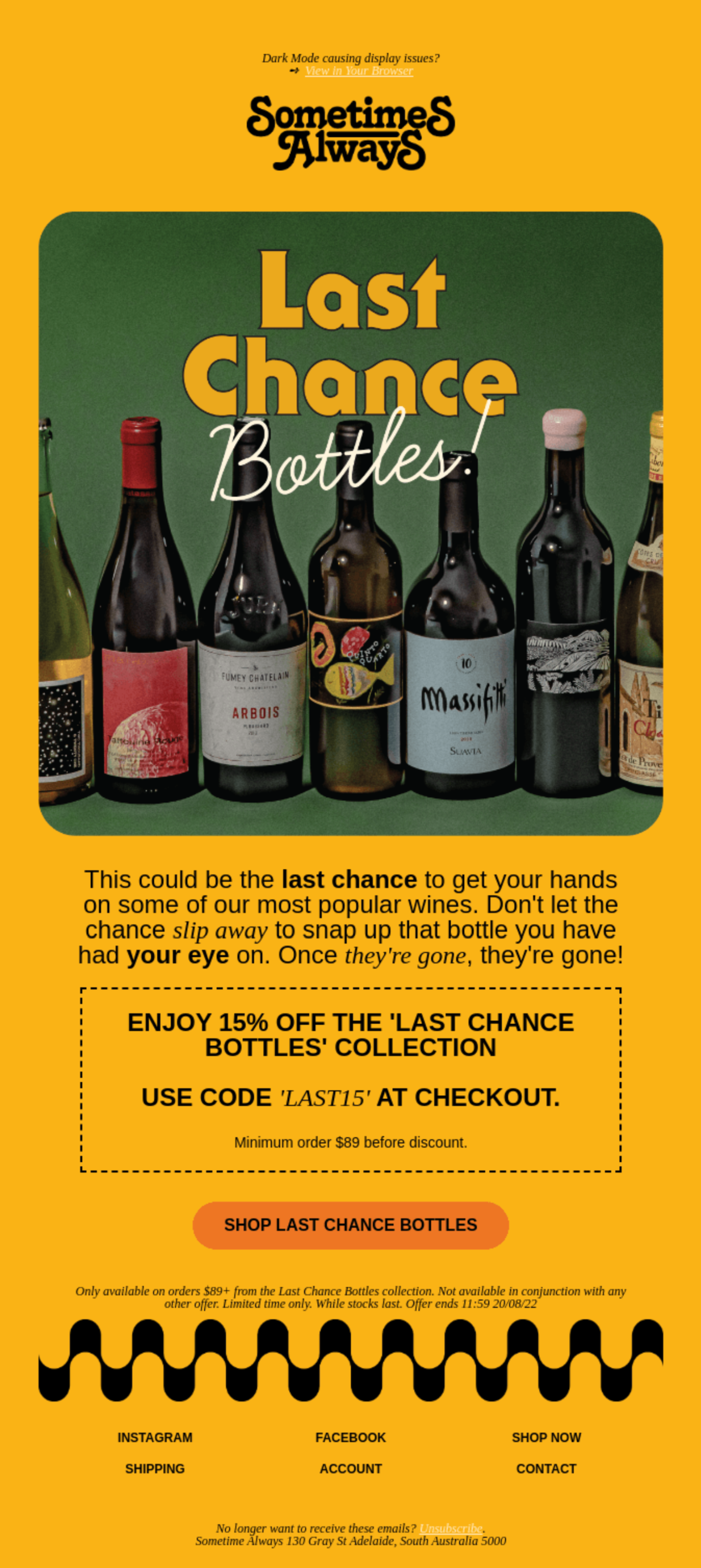

Sometimes Always uses ‘70s colors and fonts to create a feeling of nostalgia. Source: Really Good Emails.
Right off the bat, Sometimes Always plays with bright color by using a vintage yellow background. But, in addition to color, Sometimes Always features fonts and imagery that bring a ‘70s feel. One feature, in particular, that screams “retro” is the rounded edges of the header image—it almost feels like an old bar coaster or a photo in an album at your grandma’s house.
2. Monochromatic Color Schemes
Including loud color in design doesn’t necessarily mean more than one color. A 2023 email design trend you can expect to see is monochromatic color schemes. This means taking one color and using different shades or hues of that color to create depth and contrast. This example from Notorious Nooch, a plant-based seasoning brand, showcases a blue monochromatic color palette.


To promote the launch of their B12 Super Nooch seasoning, Notorious Nooch used the color of the product to make a bold statement. Source: Really Good Emails.
The monochromatic design may be simple, but it’s effective. Notorious Nooch is using it to specifically promote a new product that has this same color blue packaging. It’s a smart choice to introduce a new product in an email that makes the color impossible to forget. Plus, this electric blue will certainly stand out in inboxes.
3. Highlighted Text and Images
Aligning with the bold and playful use of color, we’re going to also be seeing a lot of highlighting certain words or images to draw attention to them. Rather than changing the color of the text itself, highlighting creates contrast and offers an opportunity to add even more color. This example from Venmo, the money transfer app, shows some traditional highlighter colors—greens, pinks, oranges—that brighten the email and call out some key words and phrases.
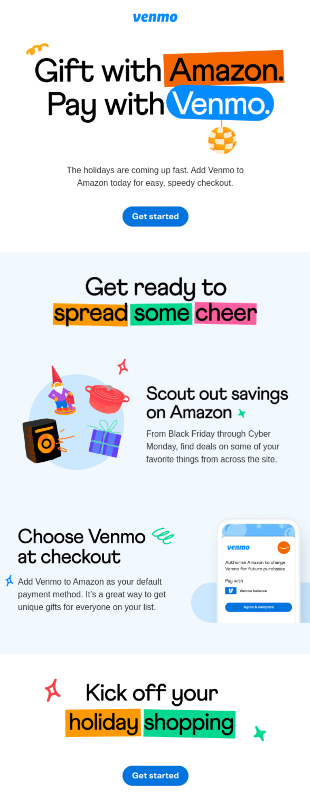

Venmo highlighted their name and Amazon’s name, along with holiday-related words, to showcase a holiday partnership. Source: Really Good Emails.
Highlighting helps draw the eye to the most important pieces of information in the email. The first thing someone sees when they open and skim this Venmo email is “Amazon” and “Venmo.” The last thing they see is “holiday shopping.” This could prompt the customer to want to learn more and continue to read and engage with the email.
4. Outlined Text
Another big and bold email design trend we’ll see in 2023 is outlined text. This is another device for drawing attention to the key information in the email while adding negative space, depth, and dimension. This example from AllTrails, an app featuring a database of outdoor trails, features the promotion, 20% off, in huge outlined text.
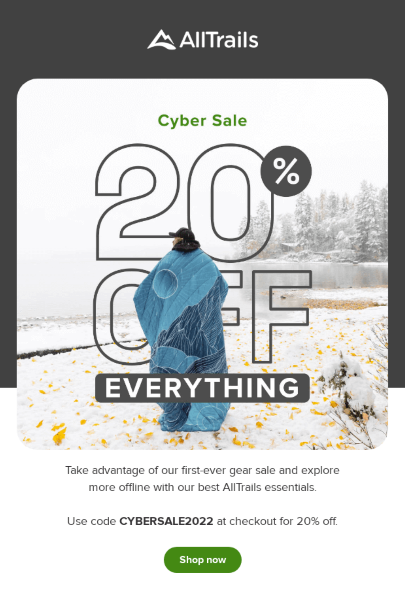

This email from AllTrails features a large outlined promotion, layered within a photograph. Source: Really Good Emails.
AllTrails was clever in their usage of outlined text because you can still see the background image. Their whole brand focuses on the outdoors, so keeping the landscape visible—while still showcasing a promotion in a large text size—aligns with their brand. They also layered the image and words in a way that creates a foreground, middle ground, and background, which adds interest.
5. Hints of Illustration
We’re also going to see a lot of illustration popping up in emails. But, it will be combined with photography. The illustrations act as an accent to the photography and inject the brand’s colors and style to enhance the look and feel of the email. This example from Austin East Ciders, an Austin-based cider brand, features their new sangria cider flanked by illustrated fruits.


Austin East Ciders uses illustrated fruit to showcase their new sangria cider. Source: Really Good Emails.
What’s particularly clever about this email is the illustrated fruit at the top is then mirrored by a photo of fruit at the bottom. The two elements are similar, which creates consistency, but in the header image the can of cider is the star against the illustrated fruit. (Also, is that a nod to Viva Magenta we’re seeing in the bottom photo?)
Making a Statement in 2023
These 2023 email design trends are all about making a statement—they’re loud, they’re bold, they’re playful. Adding color, outlines, highlights, and illustrations can help emails catch customers’ attention.
But, if all emails start to be visually bold, your brand will have to be strategically bold to set yourself apart. Design can help open the door to engaging customers, but the content of the emails, including personalization, can keep them engaged. Being bold goes beyond design in 2023.
To learn more about Iterable and how it can take your email marketing strategy to the next level, schedule a demo.

